ux design, user research
Chase Bank
Adding a new feature to an existing application and brand

ux design, user research
Capstone for UX Academy
4 weeks
UX/UI Designer
Chase Bank is one of the largest banks in the U.S., serving over half of America's households. Through their research, they discovered that younger generations are using their mobile phones more often than desktop. They also found that 71% of American households are involved in very light financial planning. To help empower the lives of their customers, Chase wants to expand on their personal finance management capabilities on their mobile app.
Conduct research to discover opportunities for Chase Bank to expand on their finance management capabilities. Then, test and integrate the new features, including a spending tracker and savings goal feature, into the Chase Bank mobile app.
This is a speculative project completed for educational purposes.
To determine opportunities, the research phase began with a lot of secondary research, including competitive analysis and market research. To discover how users managed their personal finances currently, a user survey was created and user interviews were conducted.
Chase wants to add in a new feature that will improve the lives of their customers. How will a competitor analysis help with this? I discovered what features personal finance management applications have and gained a better understanding of the current market. By comparing personal finance management software and applications, I identified their strengths and weaknesses. I could also gather data about the general affinity for each application by reading reviews, articles, and more. However, I was limited to the Google Play Store during my research.
After examining competitor applications, I discovered:
A user survey was created and sent out via various channels including social media, the Designlab community, and the Design Buddies community. It targeted customers of Chase Bank with the goal of identifying user attitudes towards the mobile banking app and recruiting interview participants. 9 total responses were received.
To gain a better understanding of the user, I conducted 1:1 interviews. Due to time and location restraints, I interviewed 7 people ages 24-53 that are or were customers of Chase Bank from a variety of backgrounds. The sample was limited to friends, family, and classmates. The interviews were focused on gaining insight on how people currently manage their personal finances.
From the beginning, I knew that Chase wanted to target Millennials due to their previous research. But, I still wanted to use my research to validate any assumptions and previous research. Through the user interviews, I was able to craft two personas to represent our target user.
Instead of creating empathy maps, I chose to create retrospective user journey maps. I created one map for each persona based on the journey of saving money for a trip. Illustrating the current user journey revealed the pain points and potential opportunities for us to improve the current experience.


With the main problems laid out, it was time to determine what new features I wanted to create in order to improve the lives of our users. I came up with these solutions to the pain points:
However, in the midst of my research, Chase Bank ended up integrating their own Spending Summary feature that broke down users' spending into categories. After some thought and analysis, I discovered opportunities for improvement for the feature and decided to make changes instead of creating an entirely new feature.
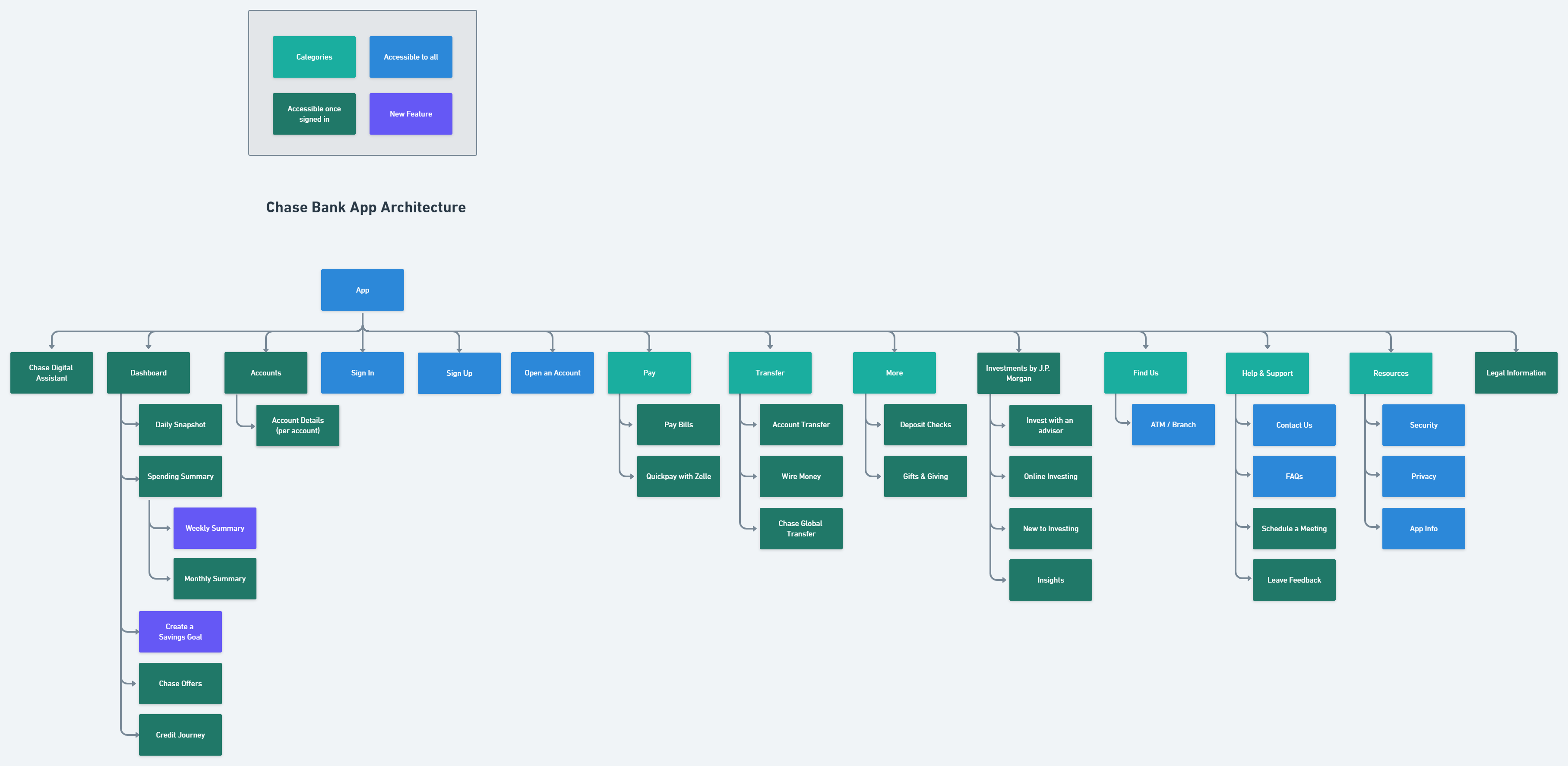
Due to the limitations of the project, I did not have access to Chase Bank's app architecture. But, I still wanted to visualize where these new features would fit in the app. I recreated the app architecture to the best of my ability based on assumption and my own analysis of the app through personal use.
To determine how the features might be used, I chose to create a task and user flow. Both showcase the same journey as the journey maps; the process of saving for a Europe trip, but this time with the new features that we had in mind.


With the features and architecture defined, it was time to design the wireframes. I started off by sketching a bunch of sketches for all the screens needed for each feature. Out of those, I created mid-fi wireframes using Figma. After receiving feedback from my mentor and classmates, I iterated the design as I moved into creating the prototype with higher fidelity UI design.
Before the first round of usability testing, testing goals had to be determined. I crafted a usability test plan and created a high-fidelity Figma prototype for remote testing. It was important to test whether my design decisions were easy to understand and use. I recruited 6 participants and gave them tasks over Zoom to complete with specific scenarios using the prototype. I observed their behaviors, thought processes, and gathered feedback to use to aid future iterations.
When exploring the Spending Summary, majority of test participants wanted to know what the categories meant and it was not obvious how to find that information. Majority of participants also thought that the title of the Savings Goal was interactive due to its similar appearance to the Spending Summary tab. While creating a Savings Goal, some participants wanted to be able to input how much they wanted to save monthly or weekly instead of setting a total goal.
The information and feedback gathered from the usability tests allowed me to create an affinity map! This helped me figure out common problems that could be fixed in future iterations.

This project was challenging. It came with its curveballs and I had to pivot and think fast along the way. It was a great learning experience.
If I was given more time to complete the project, these would be my next steps:
.png)

